An AO3 data response question
Using perception data
[Once upon a time, when I was Chief Examiner at AQA, I used to really enjoy finding data that I could use in examination questions. The data could be a graph, a table, a map or a photo that was relevant (of course), interesting, but most importantly had some quirks in it that would enable students (and their teachers) to ‘get into it’ either as a response activity or a stimulus activity.
Some of you may have seen the recent post by the data scientist Hannah Ritchie regarding people’s perception of their own lives vis-à-vis their perception of their country. You can read the full piece here.
It occurred to me that two of the figures in the piece could be used to train students how to tackle data response (AO3) questions. The context of the figures bears no relation to any part of the current A Level Geography specifications, but as content (i.e. knowledge) shouldn’t really form the part of any answer to a data response question, a neutral topic such as perception can be used to illustrate and refine skills.
Remember, from an examination question setter point of view, data in a data response, or indeed a data stimulus, question should be totally unfamiliar to a student.
This is what follows.]
In A level Geography questions AO3 is usually assessed though Data Response questions. This is where data is given, and the question often asks the student, using a variety of command words, to essentially describe what the data shows. Other commands may include complete, calculate, summarise, interpret and outline. The examination boards AQA and Eduqas use the command word ‘analyse’ for their 6-mark data response questions.
Questions that assess AO3 tend to carry low mark tariffs, up to a maximum of 6 marks.
For questions over 4 marks, Levels marking operates:
· in general, simple or obvious statements will access Level 1.
· more sophisticated statements will access Level 2.
Advice
Here are some general tips about addressing such AO3 questions:
· look out for patterns/ranges/trends
· make use of clear adjectives and adverbs – steep, gentle, rapidly, slowly, small, large, most(ly), the majority, only. [Avoid words such as ‘steady’ and ‘gradual’, and do not give a list of ups and downs]
· identify anomalies/counter-trends
· manipulate the data (e.g. be quantitative such as calculate percentages, or fractions; or use qualitative descriptive words, as given above) - don’t simply ‘lift’ or copy them
· make connections/draw relationships between the different sets of data if more than one set is provided
· be prepared to question, or comment on, and/or criticise such relationships, or indeed the data provided.
DO NOT ATTEMPT TO EXPLAIN THE DATA.
Below is a question where I have used perception data from a recent Substack by Hannah Ritchie. I have provided an answer to follow – can you see where I have followed my own advice?
Question
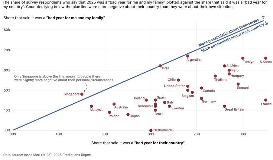
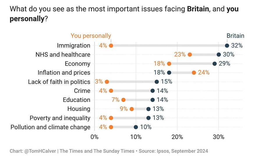
Figures 1 and 2 provide information on the perception of people both around the world, and within the UK. Analyse the data shown in Figures 1 and 2.
Figure 1. People tend to be more pessimistic about their country as a whole than they are about their own personal circumstances (2025)
Figure 2.
A sample answer
Figure 1 shows that people around the world are more likely to say that 2025 was bad for their country than to say it was bad for them and their family. The blue line represents where these responses would be even; for example, where 60% of people said it was a bad year for them, and 60% said it was bad for their country. Every country, with the anomaly of Singapore, lies below this line. For example, 85% of the French said it was a bad year for France, but only 45% said it was bad for them. The French were particularly negative compared to other countries.
Looking at Figure 2, we can see a similar outcome. People have by and large greater concerns about certain issues for Britain as a whole than how those same issues affect them. For example, 32% of people thought that immigration was an important issue for the country, and yet just 4% said that it was important to them personally. Very few say a lack of faith in politics is one of the most important issues affecting them personally, but a much larger share (5 times greater) sees it as one of the biggest issues facing Britain. Crime, education, poverty, and the economy were all bigger issues for the country than for them. One anomaly stands out - inflation and prices - where people felt affected by their own cost of living issues than was the case across the country.
I can conclude that both sets of data show one overarching perception – namely, that people are generally more optimistic about their own lives no matter what is taking place in the country around them.


