


Having published a few Substacks on the differential between AO1 and AO2, it is time to examine the third assessment objective - AO3. It is defined by Ofqual (the exam regulator within the UK) as:
AO3: to use a variety of relevant quantitative, qualitative and fieldwork skills to: investigate geographical questions and issues; interpret, analyse and evaluate data and evidence; construct arguments and draw conclusions.
In A level Geography questions AO3 is usually assessed though Data Response questions. This is where data is given, and the question often asks the student, using a variety of command words, to essentially describe what the data shows. Other commands may include complete, calculate, summarise, interpret and outline. The examination board AQA uses the command word ‘analyse’ for their 6-mark questions.
Questions that assess AO3 carry low mark tariffs. They range from 1 to 6 marks.
For questions with a tariff of 1 to 4 marks, the general rule is that each correct point is awarded one mark – known in the trade as ‘penny-a-point’ marking. For questions over 4 marks, Levels marking operates:
· in general, simple or obvious statements will access Level 1.
· more sophisticated statements will access Level 2.
Here are some general tips about addressing such AO3 questions:
· look out for patterns/ranges/trends
· make use of clear adjectives and adverbs – steep, gentle, rapidly, slowly, large, only [Avoid words such as ‘steady’ and ‘gradual’, and do not give a list of ups and downs]
· identify anomalies/counter-trends
· manipulate the data (e.g. be quantitative such as calculate percentages, or fractions; or use qualitative descriptive words, as above) - don’t simply ‘lift’ or copy them
· make connections/draw relationships between the different sets of data provided
· be prepared to question, or comment on, and/or criticise such relationships, or indeed the data provided.
Two questions, and answers to them, are provided below: one physical and one human. Students have about 8/9 minutes to answer these questions. Two copies of the answers to each question are provided:
· The answer with no labelling
· The answer with the ‘trigger words/phrases’ identified in bold. Trigger words indicate where credit can be awarded.
[Note that knowledge is not required for these questions, so do not try to explain the data - although you may be correct in such statements, you will NOT gain any credit for them. Both answers given below inevitably provide such statements, and although they may be true, they are not creditworthy.]
Question 1.
Table 1 shows the distribution of the world’s water by source. Outline the main features shown in Table 1. (6 marks)

Answer 1
The first thing to note is that vast majority of water on this planet is stored within the oceans, over 96% in fact. This water is not potable and is saline in nature. Another 1% (or nearly) consists of saline groundwater, which again cannot be used for drinking purposes. This leaves only a relatively small amount that can be used for drinking – about 2.5%.
The majority of this freshwater is tied up in the cryosphere – as ice caps, glaciers and permanent snow – over 2/3rds of the freshwater. Once again much of this is unavailable for people to use unless it is melted or melts naturally. Actually, this is unlikely as the great ice caps of Antarctica and Greenland are unlikely to ever melt fully.
So, the freshwater that people can use – from rivers, groundwater and as precipitation from the atmospheric store – is very small in amount indeed. Any small change in these stores possibly from climate change, or from pollution activities by humans could have dire consequences. Life on Earth, whether human or animal, greatly depends therefore on these stores and the changes that may take place within them.
Answer 2
The first thing to note is that vast majority of water on this planet is stored within the oceans, over 96% in fact. This water is not potable and is saline in nature. Another 1% (or nearly) consists of saline groundwater, which again cannot be used for drinking purposes. This leaves only a relatively small amount that can be used for drinking – about 2.5%.
The majority of this freshwater is tied up in the cryosphere – as ice caps, glaciers and permanent snow – over 2/3rds of the freshwater. Once again much of this is unavailable for people to use unless it is melted or melts naturally. Actually, this is unlikely as the great ice caps of Antarctica and Greenland are unlikely to ever melt fully.
So, the freshwater that people can use – from rivers, groundwater and as precipitation from the atmospheric store – is very small in amount indeed. Any small change in these stores possibly from climate change, or from pollution activities by humans could have dire consequences. Life on Earth, whether human or animal, greatly depends therefore on these stores and the changes that may take place within them.
Question 2
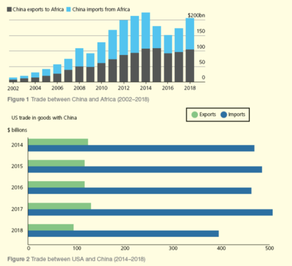
Figure 1 shows trade between China and Africa (2002-2018), and Figure 2 shows trade between the USA and China (2014-2018). Analyse Figures 1 and 2. (6 marks)
Answer 1.
China’s trade with the USA involves a huge amount of money, usually over $600 billion a year, although there was a fall in this during 2018, where it fell to $500 billion. This amount of trade is three times more than that with the whole continent of Africa, where the total amount of trade exceeded $200 billion only three times, peaking in 2014.
A big difference shown in the data is that trade with Africa has steadily increased up to 2014, although there were some fluctuations after this date. Similar fluctuations in this time period also occurred between China and the USA, so perhaps the differences are not that clear after all. We don’t have the similar data before 2014 for the USA/China trade.
In most years China has had a trade deficit with Africa, importing more than exporting. However, this has changed in the last four years as exports have been larger than imports – a trade surplus. On the other hand, China has always had a huge trade surplus with the USA (therefore a trade deficit for the USA) – over $300 billion every year.
It is fair to say that trade between China and Africa is more balanced than that between USA and China.
Answer 2
China’s trade with the USA involves a huge amount of money, usually over $600 billion a year, although there was a fall in this during 2018, where it fell to $500 billion. This amount of trade is three times more than that with the whole continent of Africa, where the total amount of trade exceeded $200 billion only three times, peaking in 2014.
A big difference shown in the data is that trade with Africa has steadily increased up to 2014, although there were some fluctuations after this date. Similar fluctuations in this time period also occurred between China and the USA, so perhaps the differences are not that clear after all. We don’t have the similar data before 2014 for the USA/China trade.
In most years China has had a trade deficit with Africa, importing more than exporting. However, this has changed in the last four years as exports have been larger than imports – a trade surplus. On the other hand, China has always had a huge trade surplus with the USA (therefore a trade deficit for the USA) – over $300 billion every year.
It is fair to say that trade between China and Africa is more balanced than that between USA and China.
I’ve been using these in revision sessions and have found them extremely valuable