[I have written a similar post to this one 18 months ago – you can find it here.]
In A level Geography questions AO3 is usually assessed though Data Response questions. This is where data is given, and the question often asks the student, using a variety of command words, to essentially describe what the data shows. Other commands may include complete, calculate, summarise, interpret and outline. The examination board AQA uses the command word ‘analyse’ for their 6-mark data response questions.
Questions that assess AO3 carry low mark tariffs. They range from 1 to 6 marks.
For questions with a tariff of 1 to 4 marks, the general rule is that each correct point is awarded one mark – known in the trade as ‘penny-a-point’ marking. For questions over 4 marks, Levels marking operates:
· in general, simple or obvious statements will access Level 1.
· more sophisticated statements will access Level 2.
Advice
Here are some general tips about addressing such AO3 questions:
· look out for patterns/ranges/trends
· make use of clear adjectives and adverbs – steep, gentle, rapidly, slowly, small, large, most(ly), the majority, only. [Avoid words such as ‘steady’ and ‘gradual’, and do not give a list of ups and downs]
· identify anomalies/counter-trends
· manipulate the data (e.g. be quantitative such as calculate percentages, or fractions; or use qualitative descriptive words, as given above) - don’t simply ‘lift’ or copy them
· make connections/draw relationships between the different sets of data if more than one set is provided
· be prepared to question, or comment on, and/or criticise such relationships, or indeed the data provided.
Below is a question that has been set by one exam board in recent years carrying 6 marks, hence requiring Levels marking. I provide an answer to this question. Note that students only have about 8/9 minutes to answer such a question.
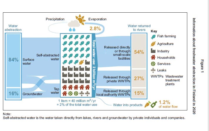
Figure 1 shows information about freshwater abstraction in Finland in 2020.
Analyse the data shown in Figure 1. (6 marks)
Answer
Figure 1 shows that the great majority of freshwater abstraction in Finland in 2020 was from surface water, such as lakes and rivers. The total amount is huge – 2 billion m3/yr. Only about 20% of this water went into households and related services (including 4% being lost through leaks). Almost half of the water (48%) went into farming (the dominant user being fish farming), abstracted by private farmers, with the remainder being used by industry.
The great majority of this water (96%) then returns to rivers (and I suspect to lakes too as Finland has many lakes – though not stated by the figure). A very small % evaporates (Finland is not a warm country). Less than half of the water returns through wastewater treatment plants, though there may be some treatment by small-scale plants. Most is released directly - it makes you wonder whether the water returns to nature with the same quality as when it was abstracted.
Finally, it is worth pointing out that the diagram is a mix of actual numbers (LH and RH sides), flow lines and emoji type features (centre) which doesn’t make quick analysis easy.
You can decide how good this answer is, but you can look how many of my tips have been followed.


